
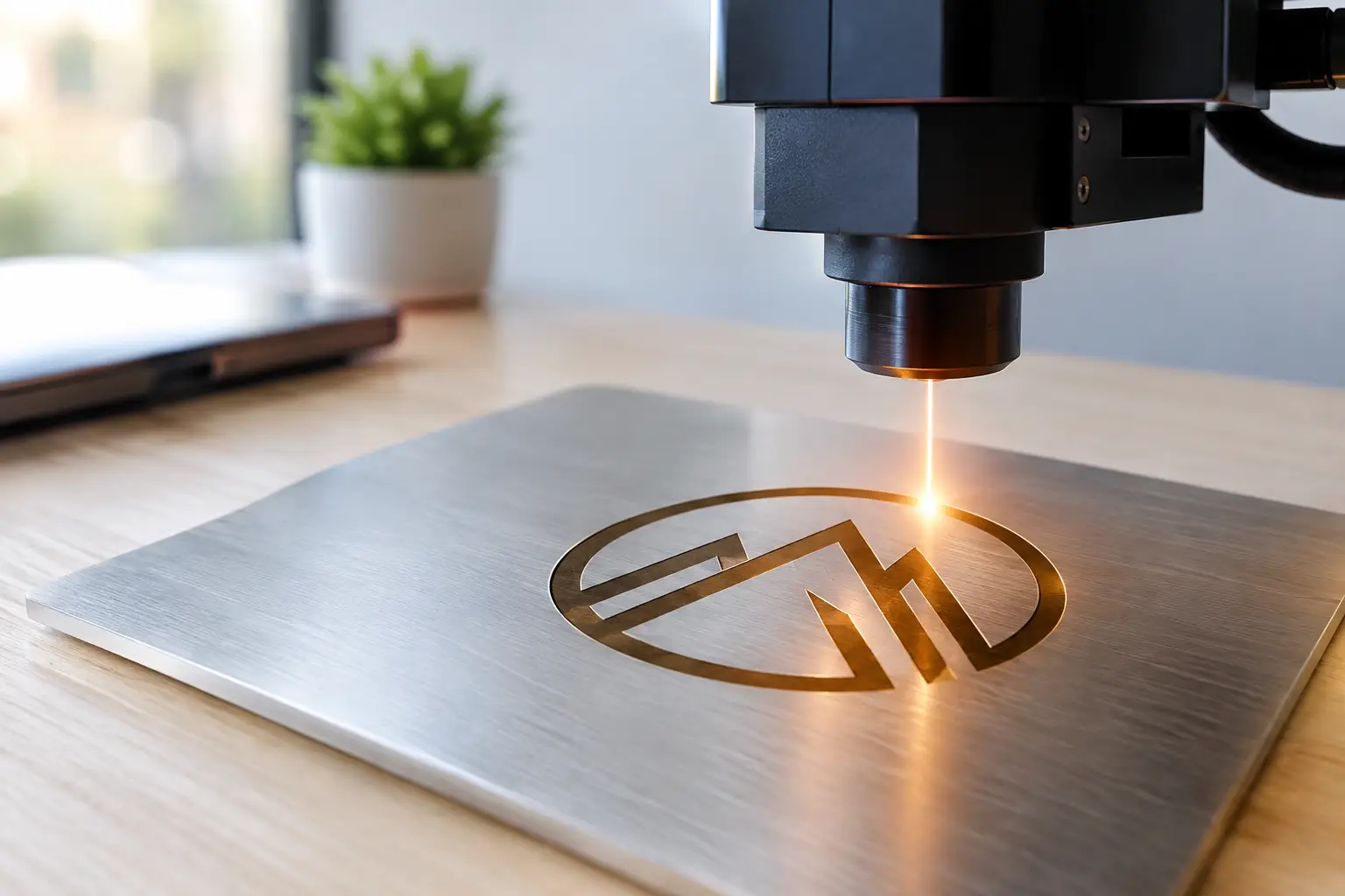
A logo on a screen is branding. A logo cut through haze in brilliant RGB laser light becomes a moment. For marketers, event planners, touring teams, and venue operators, learning how to design laser logos means understanding that a laser graphic is not a printed mark or a video file. It is a live, moving beam drawing in real time – and every curve, point, color, and placement affects its impact.
The best laser logos deliver instant recognition from across a ballroom, arena, festival field, or outdoor event site. They feel sharp, intentional, and larger than life. Achieving that WOW factor starts with designing for the physics of laser projection, not just for a brand style guide.
How to Design Laser Logos for Live Projection
The first rule is simple: simplify before you animate. A laser projector traces a logo as a sequence of vector paths. Unlike a video projector that displays every pixel at once, a laser scanner must travel around every letter, line, and graphic element. Complex art can look great in a PDF and turn into a dim, flickering image when the scanner has too much detail to draw.
Start with the most recognizable version of the logo. In most cases, that means the wordmark, icon, or a tightly controlled combination of the two. Remove tiny taglines, fine print, textured fills, hairline borders, and decorative flourishes that will disappear at event distance anyway. A logo needs to read in a split second, especially when it appears between songs, during a grand entrance, or above a roaring crowd.
Bold, open letterforms perform best. Sans-serif type is often easier to scan cleanly than ornate scripts or tightly packed serif fonts. If a client’s identity depends on a script logo, it may still be usable, but the production team may need to simplify joins, thicken strokes, or separate overlapping characters. That is not a compromise in brand quality. It is how the logo becomes more powerful in the air.
Build From Clean Vector Artwork
Give your laser production team a true vector file whenever possible. AI, EPS, SVG, and clean PDF artwork are ideal starting points because they contain the mathematical paths needed for laser programming. A high-resolution PNG may be helpful as a visual reference, but it does not provide the clean paths required for a polished laser animation.
Before a logo reaches the projector, technicians typically optimize it for scanning. They reduce unnecessary anchor points, close broken paths, correct overlaps, and determine the most efficient drawing order. A circle with hundreds of points does not look better than a circle with a clean path. It simply makes the scanner work harder.
This is where professional programming separates a flashy idea from a breathtaking visual spectacle. The goal is not merely to display the logo. The goal is to make it appear bright, stable, crisp, and alive.
Design for Distance, Scale, and Surface
A laser logo has to work in the actual room or outdoor environment, not just on a designer’s monitor. A 10-foot logo over a dance floor has different requirements than a 100-foot corporate mark projected onto a building facade or a massive aerial graphic above a concert crowd.
For indoor events, haze is often the secret ingredient. It makes the beam paths visible in the air, turning a logo reveal into pure visual magic. Without atmospheric haze, a laser can still project onto a surface, but the audience will not experience the same immersive volume of light. For galas, weddings, bar and bat mitzvahs, and nightclub environments, that difference can define the entire reveal.
Outdoors, ambient light and projection distance become major factors. A logo intended for a dusk product launch may need stronger color and fewer details than one used after dark. Streetlights, stage lighting, LED walls, moonlight, and even reflective surfaces all affect visibility. Bigger is not always better, either. If a logo is stretched too wide, its brightness can fall off and its fine features can lose clarity.
A professional team evaluates the viewing angle, audience size, throw distance, atmospheric conditions, projection surface, and available laser wattage before finalizing the artwork. Systems ranging from 40 watts to 200 watts or more can create extraordinary results, but power alone does not fix a design that is too intricate for its intended use.
Use Color With Purpose
RGB laser systems can create vivid color, but color choices should serve visibility rather than simply replicate every brand swatch. Bright green is exceptionally visible to the human eye, while red and blue can require more output to feel equally intense. White laser graphics are often created by blending red, green, and blue, and they can look spectacular when properly balanced.
If your brand palette uses dark navy, muted gray, or subtle pastel tones, translate the idea rather than forcing an exact match. A bright cyan, electric blue, saturated magenta, or laser white may deliver a stronger on-site result while staying true to the personality of the brand. For a luxury event, a clean white monogram with a controlled gold-toned effect may feel more refined than a rainbow sequence. For a music festival, full-spectrum color sweeps may be exactly right.
Contrast matters most. A single-color logo against a dark background can hit harder than a multicolor graphic with no visual hierarchy. Let the logo lead, then use color shifts, beam fans, and animated accents to build energy around it.
Add Motion Without Losing Recognition
A static laser logo can be impressive. A logo that arrives with timing, movement, and music synchronization can stop a room cold. The key is to animate the reveal without making the audience wait too long to understand what they are seeing.
A strong sequence might begin with a tight beam tunnel, a burst of aerial fans, or a fast line-trace that resolves into the logo. The logo can then hold long enough for photos, video, and audience recognition before transforming into a second effect. For corporate branding, a clean reveal followed by a subtle glow or rotating frame often feels polished. For a concert artist or sports team, faster motion, punchy beam hits, and music-synced transitions can raise the intensity.
Keep the logo as the hero. If effects race across the mark every second, the audience may remember the lasers but not the brand. The best programming creates a rhythm: anticipation, reveal, hold, and release.
For sponsor activations and product launches, consider where the logo appears in the event timeline. A logo reveal during the first 30 seconds of a keynote can establish presence. The same reveal immediately after a major announcement can amplify emotion. A laser logo projected repeatedly throughout a show may work well, but it needs variations so it feels like part of the production rather than a looping ad.
Plan the Show, Not Just the Graphic
The logo is only one part of a successful laser moment. It must be designed around the event’s stage layout, lighting plot, scenic elements, video walls, ceiling height, truss positions, and audience footprint. A logo that looks perfect from front-of-house may need a different angle or scale to read for guests seated on the sides.
Safety is equally central. High-powered lasers are professional show systems, not plug-and-play decorations. Beam paths must be planned to avoid unsafe audience exposure, sensitive airspace concerns, reflective surfaces, cameras, and other site-specific risks. Depending on the venue and effect, a production may use fixed projection zones, overhead aerial effects, controlled scanning, or building surfaces. Licensed, insured operators and compliant equipment are essential when the goal is a spectacular show that remains responsibly executed.
This is especially relevant for public festivals, municipal celebrations, stadium events, and large outdoor productions. The visual ambition can be enormous, but the planning has to be even more precise. Connecticut Laser Productions brings more than 20 years of show experience to that balance, creating custom laser moments that feel explosive while being built around professional operation.
Common Laser Logo Mistakes to Avoid
Most logo problems happen before the first beam is ever switched on. Avoid these four issues: overly detailed artwork, ultra-thin strokes, low-resolution raster files, and designs that rely on subtle color differences. Each one can reduce brightness, slow the scan, or weaken legibility.
Another frequent mistake is treating the logo reveal as an isolated deliverable. A laser graphic should be considered alongside music, lighting, haze, video, and the audience’s line of sight. A great mark can disappear behind a bright LED screen or lose its magic in a room with no atmosphere. Early collaboration gives the production team time to solve those details instead of making last-minute compromises.
Finally, do not judge the design only at close range. Ask how it will look from the back of the venue, through a phone camera, and during the exact lighting conditions of the show. A laser logo earns its place when it is unmistakable from every meaningful audience position.
A great laser logo does more than put a name in lights. It gives an audience a visual cue to cheer, film, remember, and share. Bring a clean brand asset, a clear creative goal, and an experienced laser team into the process early – then let the beam become the biggest signature your event has ever seen.
No responses yet